Windborne farms LLC want to promote the beauty of farm life, where everything aims to create harmony between humans and nature, celebrating the simple way of life and creating a beautiful wonderland with a magical atmosphere that shows the beauty of small farm living and its abundance.
The essence of the brand was conveyed by exploring colours, shapes and textures that directly link back to nature. It was important to communicate the beauty and simplicity of farm life, where everything works in harmony between mother nature and humans.
Brand Strategy
Identity Design Brand Collaterals
Brand Strategy
Identity Design
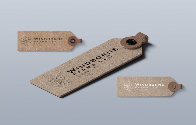
Brand Collaterals
Main logotype: Copperplate gothic
Tagline: Poppins
Copperplate gothic Aa Bb Cc Dd Ee Ff Gg Hh Ii Jj Kk Ll Mm Nn Oo Pp Qq Rr Ss Tt Uu Vv Ww Xx Yy Zz
Poppins Aa Bb Cc Dd Ee Ff Gg Hh Ii Jj Kk Ll Mm Nn Oo Pp Qq Rr Ss Tt Uu Vv Ww Xx Yy Zz
For this project, I decided to use the combination of a serif and a sans serif font.
The contraposition of this two typefaces results in a crisp and playful style, still keeping a high readability.
The modernity of Poppins in combination with the audacity of copperplate give the brand a new and contemporary feeling, yet maintaining a rural and natural vibe.
The logo mark represents a windmill. This element has a direct reference to the farm name and to the concept of being carried by the wind, letting nature guide us. This element is also linked back to the balance and collaboration between humans and nature: thanks to the wind and the human intellect, the windmill is able to transform the gifts that Mother Nature offers us into edible goods.
The strong serif font gives a rural and crispy vibe to the logo, which still maintains a modern feeling thanks to the combination with the sans-serif font.