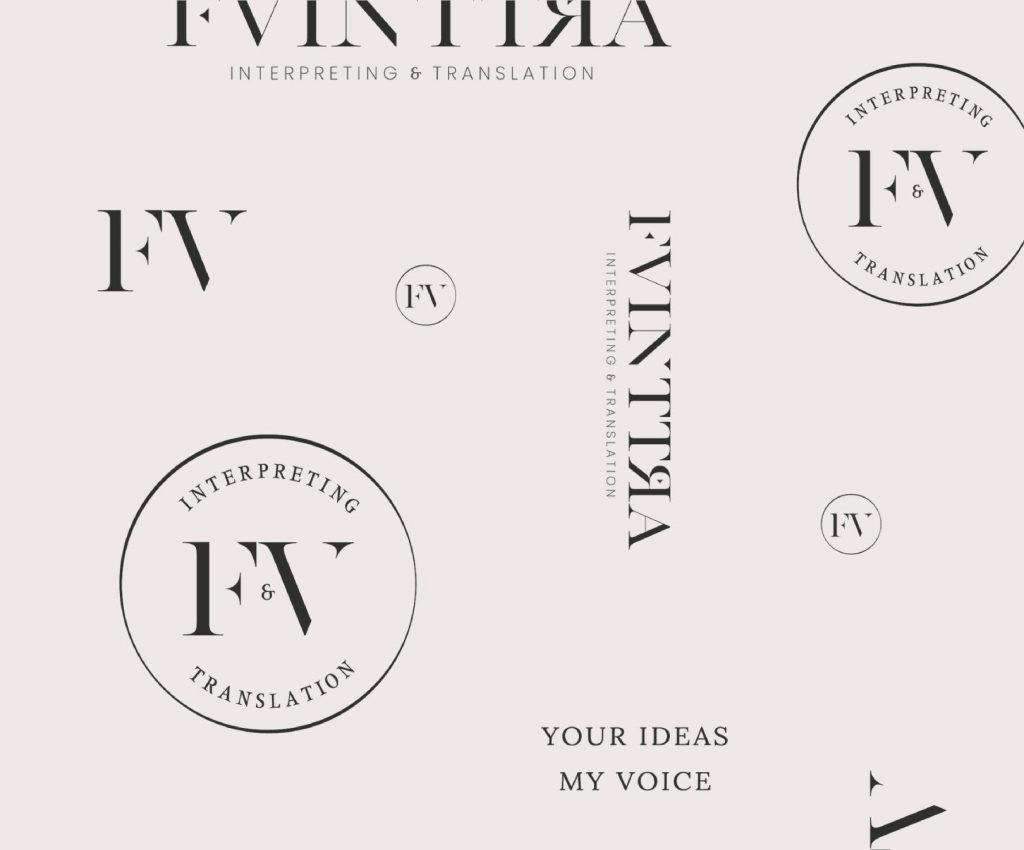
Sometimes we take for granted one of the mechanisms that moves, and stirs, our society: language. Every word has a specific value. FV INTTRA is a premium interpretation and translation studio that helps its clients to communicate their message and to break through to their listener’s hearts.
This brand is all about communication and professionalism. The approach I used to design its assets centres around clean and clear fonts, as well as bold colours that represent the company statement.
Brand Strategy Brand Identity Re-Brand
Brand Strategy
Brand Identity
Re-Brand
VALUES
VALUES
Creativity
Communication
Passion
Strength
Courage
Trust
Professionalism
Main logotype: Lora
Tagline: Poppins
LORA
Aa Bb Cc Dd Ee Ff Gg Hh Ii Jj Kk Ll Mm Nn Oo Pp Qq Rr Ss Tt Uu Vv Ww Xx Yy Zz
Poppins Aa Bb Cc Dd Ee Ff Gg Hh Ii Jj Kk Ll Mm Nn Oo Pp Qq Rr Ss Tt Uu Vv Ww Xx Yy Zz
For this project, we decided to use a well-balanced and contemporary serif font, and a clean and versatile sans-serif to make the copy well-readable and clear.
The harmonic combination between the typefaces gives a trustworthy, communicative and professional feeling, perfect for the purpose of this project.
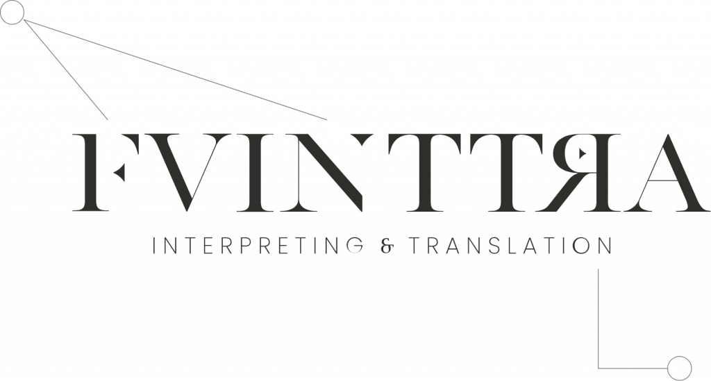
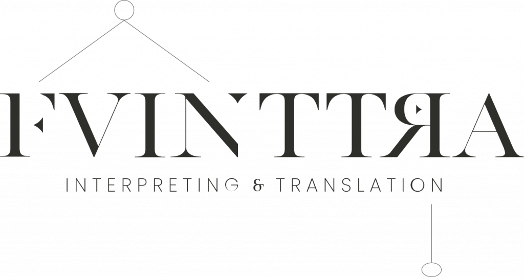
The small gaps in some of the letters in the first part of the logo are meant to recall the concept of interpretation, where it is important to connect all the dots in order to discover and explain what is written in a text or speech made in a different language.
The inverted R with the arrow pointing outward was created with the intention of recalling the translation process between one language and another. The contrast between the direction in which the letter R is turned and that of the arrow is precisely meant to highlight this possibility of exchange between one language and another.