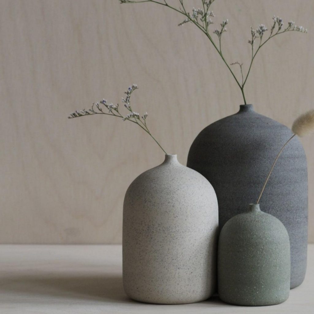
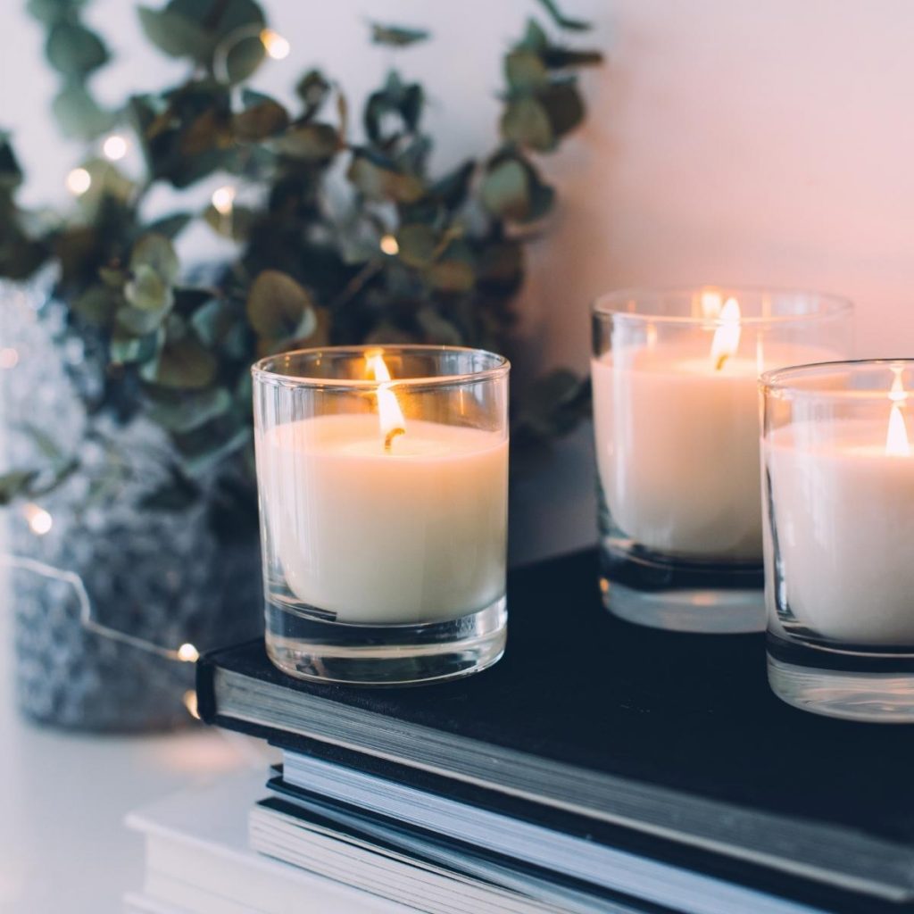
Candle Bay Co is a local business that produces hand-poured candles with a luxury and refined taste. The look and feel needed to communicate this in an elegant, eco-friendly and accessible way, but still keeping that premium vibe that a spa can give. The main concept behind the brand is to provide a moment of peace and serenity in the comfort of your home.
Candles can be a remedy, enabling us to relax, slow down and unwind. The outcome of the project wanted to reflect exactly this. We found important to incorporate an illustration that, in its simplicity, remind the warmth and calm vibe of a lit candle.
When starting a new project, I always make sure to first understand the brand and the client by conducting a thorough analysis of the brand’s values and vision. This helps me not only to create the best concept for the logo but for the entire brand identity as well.
Quality
Elegance
Luxury
Communication
Calm
Relaxation
The wavy form of the A recalls the flow of energy that brings serenity and relaxation when you are in the comfort of your home – or in a spa – and decide to take a moment to focus just on yourself, maybe while enjoying the atmosphere and the positive vibes that come with a lit candle.
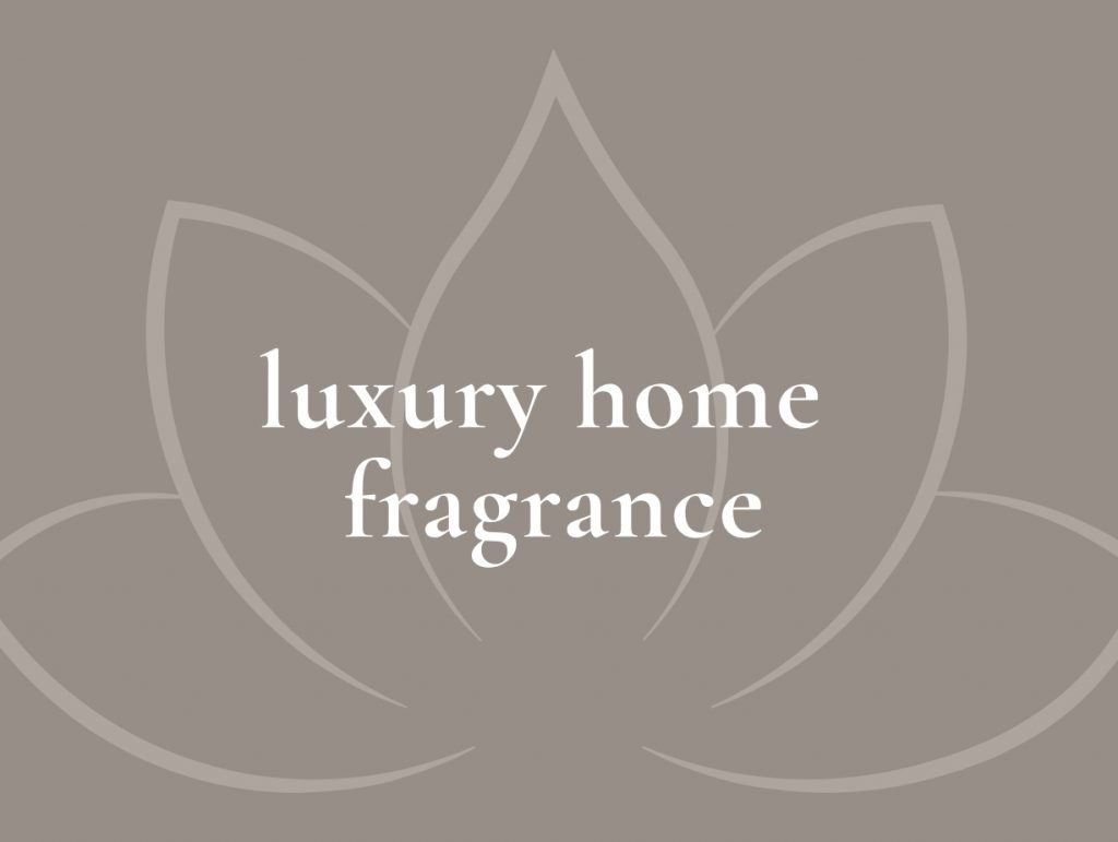
The logo mark for Candle Bay Co wants to convey a sense of relaxation and inner peace when you decide to take a moment just for yourself, to reconnect with your body and soul in the comfort of your home. A lotus composed of the flame of a candle was the perfect image for this purpose. These two symbols together represent beauty and connection with the universe. A symbol of growth and enlightenment that perfectly fits with the vision of this brand.
The diamond on top of the letter L and in the O gives a refined vibe to the logo, representing the elegance and luxury feeling that the brand wants to convey. Furthermore, the diamond on top of the letter L reminds of the lit of a candle that sparkles and brings the customer into a luxurious relaxation.
The logo mark for Candle Bay Co wants to convey a sense of relaxation and inner peace when you decide to take a moment just for yourself, to reconnect with your body and soul in the comfort of your home. A lotus composed of the flame of a candle was the perfect image for this purpose. These two symbols together represent beauty and connection with the universe. A symbol of growth and enlightenment that perfectly fits with the vision of this brand.
The wavy form of the A recalls the flow of energy that brings serenity and relaxation when you are in the comfort of your home – or in a spa – and decide to take a moment to focus just on yourself, maybe while enjoying the atmosphere and the positive vibes that come with a lit candle.
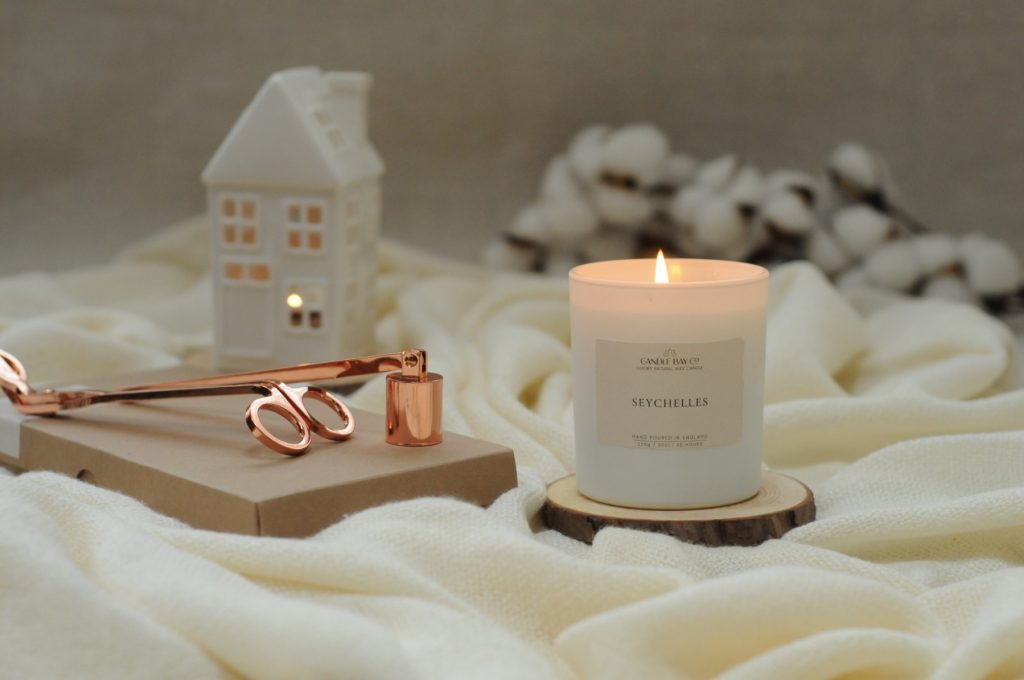
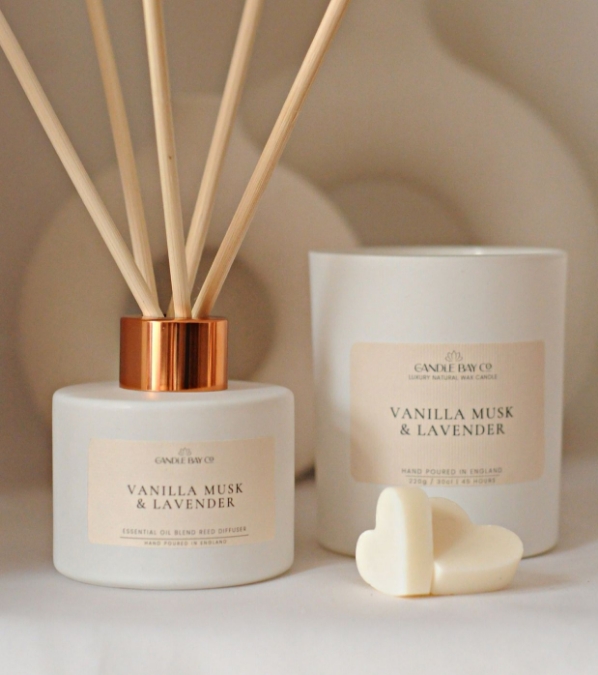
LABEL DESIGN
LABEL DESIGN
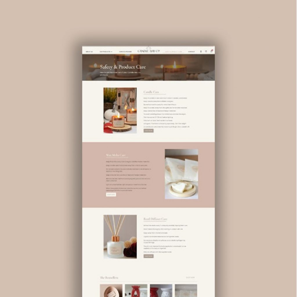
For the labels I decided to create a minimal and simple design. This makes sure to keep consistency of the brand’s values in all of its assets, conveying a sense of elegance and harmony. Furthermore, the curves lines used on the package’s label are there to recall the flame of the candles and their fragrances.
Main logotype: Cormorant Garamond
Tagline: Poppins
Cormorant Garamond Aa Bb Cc Dd Ee Ff Gg Hh Ii Jj Kk Ll Mm Nn Oo Pp Qq Rr Ss Tt Uu Vv Ww Xx Yy Zz
Poppins Aa Bb Cc Dd Ee Ff Gg Hh Ii Jj Kk Ll Mm Nn Oo Pp Qq Rr Ss Tt Uu Vv Ww Xx Yy Zz
Cormorant and Poppins are the perfect combination to convey an exclusive and refined feeling.
The pairing of these two typefaces give a balanced and clean vibe, maintaining the brand’s distinctive elegance and minimalism.